The Psychology Behind Casino UI Colors and Layouts
The psychology behind casino UI colors influences how players navigate, notice key features, and experience casino platforms. Discover how colors, layouts, and design choices shape the overall user experience.
Casino interfaces are rarely designed by accident. The psychology behind casino UI colors comes from a mix of visual design, behavioral cues, and screen hierarchy that helps guide attention quickly.
That does not mean colors or layouts control outcomes, but they can influence how a casino site feels, how fast players notice options, and how easily they move from one screen to the next.
For curious players, especially those using modern crypto-casino platforms, understanding these design choices makes it easier to read the interface more critically.
A polished casino UI can feel immersive and smooth. A more aggressive one can feel crowded, urgent, and difficult to step away from. The difference often comes down to color, spacing, emphasis, and friction.
Why the Psychology Behind Casino UI Colors Influences Player Behavior
Color affects perception before a player reads a single word. In casino UI, it helps signal mood, status, urgency, and reward. The goal is usually not to tell players what to think directly, but to create a fast emotional context around buttons, balances, jackpots, and promotions.
That is why casino interfaces often rely on high contrast and familiar color associations. Players may interpret certain colors as safer, more exciting, or more valuable even when the information itself has not changed. That can shape where the eye lands first and what feels most important in the moment.
Common psychological effects include:
Attention capture: bright accent colors stand out against dark backgrounds
Perceived trust: clean contrast and orderly spacing can make a platform feel more stable
Urgency: red or flashing highlights can make limited-time offers feel more immediate
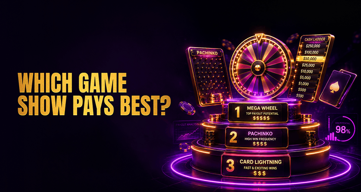
Reward anticipation: gold and glowing effects often frame bonuses, VIP tiers, or jackpot figures
Decision fatigue: too many competing colors, banners, and cards can make players act faster just to reduce overload
That last point matters. Visual complexity does not force behavior, but it can reduce reflection time. This connects naturally with broader behavior patterns, including emotional impulses and habit loops discussed in Gambling Cravings: Why They Happen.
What Dark Backgrounds and Bright Accents Signal in Casino Design
One of the most recognizable patterns in casino UI is the dark base layer paired with bright neon or metallic accents. This is especially common in crypto-casino style design, where black, charcoal, or deep navy backgrounds are combined with electric blue, purple, green, or gold highlights.
There are several reasons this works so well visually.
Dark backgrounds create focus
A dark interface reduces the prominence of empty space and pushes bright elements forward. Jackpot totals, featured games, claim buttons, and active tabs appear sharper and more dramatic against a darker screen. This can create a premium, immersive feel that resembles gaming setups, nightlife aesthetics, or high-tech dashboards.
Neon accents create energy and direction
Bright accent colors are often used sparingly to guide the eye. A neon green deposit button, a glowing purple category tab, or a bright blue active menu state can quickly show where the next action lives. In moderation, this feels intuitive. Overused, it starts to feel noisy.
Gold highlights signal value and reward
Gold is commonly tied to VIP treatment, premium bonuses, jackpot counters, and elite tiers. Psychologically, it suggests exclusivity and importance. It does not make an offer better, but it can make it look more significant.
Red cues create urgency
Red often appears around countdowns, expiring offers, alert badges, or limited banners. It is a strong attention color and can make an area feel time-sensitive. Still, it is better understood as an urgency cue than a universal trigger. Red may increase salience, but it does not affect everyone the same way.
Green signals confirmation and progress
Green is frequently used for success states, active balances, completed actions, and positive confirmation buttons. It can make navigation feel smoother by reinforcing that a step worked as expected.
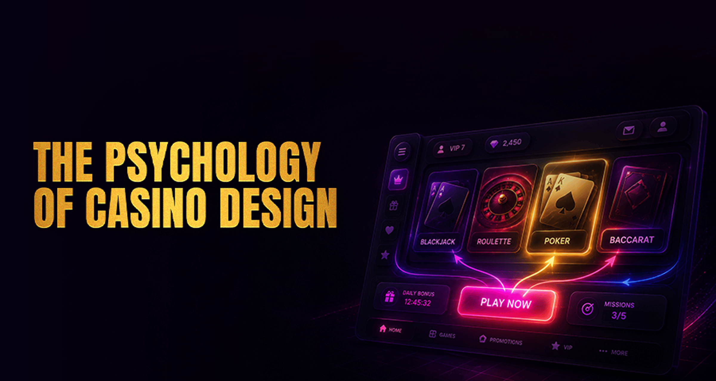
A polished dark-interface brand such as HunnyPlay reflects this broader visual language: dark backgrounds create focus, while sharper accent colors help define important actions without needing to crowd every screen.
How Layout Hierarchy Directs Attention on Casino Screens
Color grabs attention, but layout decides where that attention goes next. Casino UI layout psychology is built around hierarchy: what appears first, what appears biggest, and what seems easiest to tap or click.
Jackpot and banner hierarchy
Top-of-screen banners usually carry the highest visual priority. Large featured promotions, jackpot totals, or seasonal offers are often placed above the fold because they shape the first impression immediately. Large typography, glow effects, and motion cues make these areas hard to ignore.
Button placement and action flow
Primary buttons are usually placed where the eye naturally lands after reading a headline or scanning a game card. Deposit, play now, claim bonus, and continue buttons often sit in high-contrast positions with generous spacing around them. This reduces friction and makes the next step obvious.
Lobby card density
Game lobbies often use rows of tiles or cards with thumbnails, provider names, labels, and badges. When density is moderate, the screen feels organized and browsable. When too many cards compete at once, players may stop comparing carefully and click based on whichever tile stands out first.
Game tile emphasis
Featured games may appear larger, brighter, or higher in the grid. Small visual boosts like corner ribbons, hover glow, or autoplaying thumbnails can make one title feel more important than surrounding options.
Sticky CTAs and reduced-friction navigation
Sticky navigation bars, floating wallets, and persistent action buttons keep important controls visible without requiring extra effort. This can improve usability, especially on mobile, but it also keeps transactional options constantly within reach.
Better usability helps people move through a platform more clearly; conversion pressure begins when the same convenience is paired with nonstop urgency cues and very few pause points.
A common crypto-casino example is a dark lobby with a wallet balance pinned in the header, a glowing deposit button fixed near the top, and neon-highlighted featured games stacked above a dense tile grid.
That combination can feel sleek and efficient, but it also shows how visibility, hierarchy, and access points work together to speed up decision flow.
That reduced-friction design matters because fast action paths can affect session flow. It is related to behavior, though not identical, to how players try to stay disciplined during blackjack sessions when speed and convenience start shaping decision-making.
The Psychology of Buttons, Banners, and Reward Cues
Casino UI often relies on micro-signals that feel small on their own but powerful in combination.
Buttons
Rounded buttons, glow outlines, and strong contrast can make actions feel easy and inviting. Large tap targets lower effort. Repeating a single accent color for the main action also trains the eye to recognize the preferred path quickly.
Banners
Promotional banners do more than advertise offers. They create pacing. A carousel of rotating rewards, tournaments, or drops can keep the screen feeling active even when the player is not interacting yet.
Reward cues
Badges, counters, animated totals, and progress bars all support reward anticipation. Even simple visual cues such as a highlighted bonus tab or a gold-framed VIP icon can suggest momentum and progress.
The key point is balance. These elements influence attention and expectation, but they do not guarantee that players will behave a certain way. Good analysis of casino UI should treat design as influence, not mind control.
When interfaces repeatedly nudge fast action without much room for reflection, they can overlap with the same behavior risks discussed in Gambling Cravings: Why They Happen, where momentum starts to matter as much as conscious choice.
Premium vs Overloaded Casino UI: What Players Notice Fast
Not all high-energy design feels the same. There is a real difference between immersive premium design and cluttered high-pressure layout.
Premium design usually feels:
Visually consistent
Spacious enough to scan comfortably
Clear about what is primary and what is secondary
Polished in its use of contrast and typography
Smooth across desktop and mobile
A premium dark-interface casino style often feels intentional. It may still be stimulating, but it does not force every element to compete equally for attention.
Overloaded design usually feels:
Crowded with too many banners and badges
Dependent on constant urgency colors
Hard to scan because cards and offers blend together
Packed with competing calls to action
Mentally tiring after only a short time
This is where decision fatigue becomes more relevant. When every tile flashes, every banner feels urgent, and every area demands attention, players may stop evaluating carefully. They are not necessarily persuaded by one message. They may simply want to reduce the overload by making a quick choice.
That is one reason critical reading matters. A screen that feels intense is not always deceptive, but it may be pushing more pressure than clarity.
Players who already notice emotional speed-ups may also recognize similar patterns in articles about blackjack mistakes that cost you money over time, where rushed decisions tend to matter more than deliberate ones.
How to Read Casino UI Design More Critically as a Player
You do not need to distrust every polished interface. But it helps to notice what the design is encouraging.
Ask yourself:
Which colors are drawing my eye first?
Are the most visible elements informative, or just urgent?
Does the layout help me compare options clearly?
Are banners and reward cues helping me navigate, or pushing me to act fast?
Does this screen feel premium and readable, or cluttered and exhausting?
A good casino UI can absolutely improve usability. Better spacing, clear hierarchy, and cleaner navigation make platforms easier to understand. But the same tools can also increase momentum, reduce pause points, and keep players moving through the interface with less friction.
That is why the smartest approach is not to assume every design choice is manipulation, and not to assume it is neutral either. It is influence. Learning to see that influence helps players stay more aware of how atmosphere, color, and layout shape the experience around them.
For readers exploring premium crypto-casino design, HunnyPlay works best here as a visual example rather than a promise: a dark interface, clean contrast, and restrained hierarchy can create a more polished atmosphere without needing a louder, more cluttered screen.
The value in noticing that is not about expecting better outcomes. It is about understanding how design changes the feeling of play and how easily decisions happen on-screen.
FAQ
Why do so many casino websites use dark backgrounds with bright accent colors?
Dark backgrounds make bright buttons, jackpots, and featured content stand out more clearly. They also create a more immersive and premium visual tone that many casino brands prefer.
Do casino UI colors actually affect player decisions?
They can influence attention, urgency, and perception, but not in a guaranteed way. Colors help shape what feels important or easy to act on, though individual reactions still vary.
Why are bonus banners and spin buttons placed so prominently?
They are usually positioned high in the visual hierarchy so players notice them quickly. Prominent placement reduces friction and makes the next action easier to identify.
What makes a casino layout feel trustworthy or overwhelming?
Clear spacing, readable contrast, and organized navigation often feel more trustworthy. Layouts packed with too many banners, colors, and competing calls to action tend to feel overwhelming.
Is casino interface design meant to keep players on-site longer?
Some design choices can support longer browsing or faster transitions between actions by reducing friction and maintaining attention. That does not mean every interface is built purely to extend play, but many are designed to keep the experience smooth and absorbing.